Do you have a mother who loves to redecorate her home on a regular basis, whether it's changing up the centerpiece on the dining room table or adding new throw pillows to the living room couch? If so, you know that she has a passion for all things home design. This Mother's Day, why not show your appreciation for her unique style and give her a gift that will help elevate her home decor even more? We've rounded up a special selection of home decor gifts that are sure to delight any design-loving mom. Visit Our Beverly Hills Showroom for Inspiration!
MICHAEL ARAM
If your mom loves home decor that tells a story, look no further than the stunning collection of Michael Aram sculptures, available at our showroom. Each piece is exquisitely designed with intricate details and rich symbolism, creating a meaningful addition to any home. If your mom is a foodie or enjoys hosting dinner parties, our selection of Michael Aram kitchen and table decor is perfect for her. From beautifully crafted bowls and trays to unique glassware and flatware, each piece is expertly handcrafted and designed to impress. Plus, with our personalized gifts, you can add an extra special touch to show your mom just how much you care. Shop our selection of nature-inspired, handcrafted decor for a Mother's Day gift that will truly stand out.
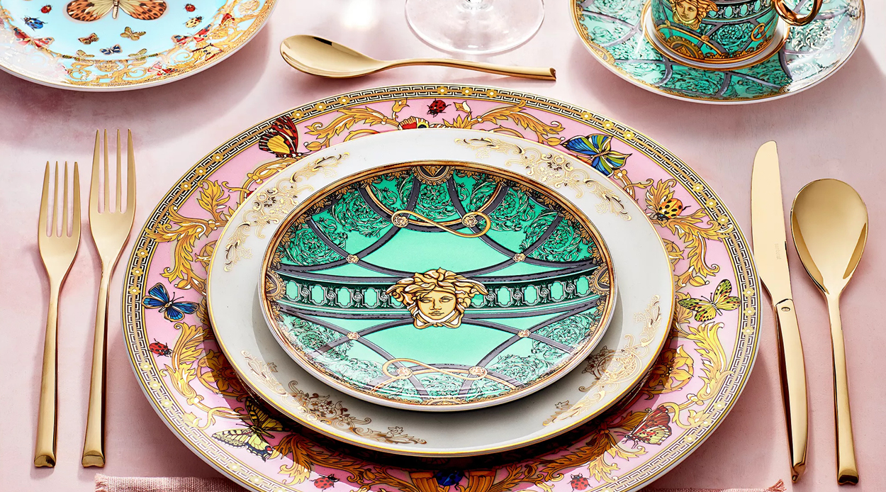
VERSACE HOME
For the ultimate luxurious Mother's Day gift, consider the stunning collection of Versace Home dinnerware, available at our showroom. Since the early 90s, Versace's entrancing table settings have adorned tables around the world, embodying the late Gianni Versace's belief that the Versace lifestyle should be all-encompassing. The Rosenthal and Versace collections, available at our showroom, offer a mesmerizing embodiment of the brand's stylistic principles. With bold colors, intricate patterns, and opulent materials, each piece is expertly crafted to elevate any dining experience. From elegant plates and bowls to exquisite cups and saucers, our selection of Versace Home dinnerware is the perfect gift for the mom who appreciates the finer things in life.
LALIQUE
If you're looking for a Mother's Day gift that truly embodies elegance and luxury, then our selection of crystal homeware by Lalique is the way to go. With over 20 years of experience selling timeless crystals, Lalique has become a go-to brand for those who appreciate the finer things in life. Our premium selection includes vases, sculptures, bowls, tableware, jewelry boxes, perfume bottles, ornaments, and more, each expertly crafted with intricate details and stunning designs. Each piece is expertly crafted with intricate details and stunning designs, making them the perfect addition to any home. Whether your mom loves to host dinner parties or simply enjoys adding a touch of elegance to her space, our selection of Laliquecrystal homeware is sure to impress. Elevate your mom's style this Mother's Day with a gift that will last a lifetime.
Are you still searching for the perfect Mother's Day gift for your mom? Don't wait until the last minute! Show her how much you care by visiting our showroom in Beverly Hills. Our carefully curated selection of home decor gifts is designed to elevate your mom's style and make her feel truly appreciated. From Michael Aram's exquisite sculptures and kitchen decor to Versace Home's opulent dinnerware and Lalique's timeless crystal homeware, we have something for every mom. Let us help you find the perfect gift to show your mom how much you love her this Mother's Day. Visit our showroom now and make her day unforgettable!
Candle size does more than impact appearance. It influences how far the fragrance travels, how evenly the wax melts, and how balanced the room feels. Many buyers focus only on scent notes. However, the candle size decides if that fragrance truly fills the space.
Choosing the right candle size for your room improves scent performance, ensures cleaner burns, and provides longer-lasting value. Here’s how to make the right choice.
Why Candle Size Matters
When the candle size does not match the room, the difference is noticeable. A small candle placed in a large living area may look nice, but the fragrance often fades before it fills the space. You might only catch the scent when standing close to it. In contrast, placing a very large candle in a compact room can make the fragrance feel heavy and concentrated.
Candle size directly influences how well it performs. It determines how far the fragrance travels, how long the candle burns, how evenly the wax melts across the surface, and how balanced the setup feels within the room.
When you choose a size that suits the space, the scent spreads evenly, the burn stays consistent, and the atmosphere feels relaxed rather than overpowering.
Consider the Room Size
Start by estimating how large the space is.
Small Rooms
Bathrooms, compact bedrooms, entryways, and small offices do not require heavy fragrance coverage.
Tealight candles work well here for light ambiance. They provide subtle scent and soft glow without overwhelming the space. A single medium candle can also work if you want a slightly stronger fragrance.
Avoid large multi-wick candles in tight spaces. They may feel too strong.
Medium-Sized Rooms
Living rooms, dining areas, and master bedrooms need better scent distribution. A 3 wick candle is often the most reliable choice for these rooms. The wider melt pool lets the fragrance spread evenly. The three flames create a stronger scent throw without needing multiple candles. If you prefer flexibility, you can place two medium candles in different areas instead of one large one.
Large Rooms and Open Floor Plans
Open layouts need more coverage. High ceilings and wide spaces spread fragrance quickly. Big candles or several three-wick candles placed in different areas work best. For instance, one near the seating area and another by the dining space. This stops the scent from concentrating in just one corner. If the room leads to hallways or other open areas, placing candles thoughtfully can improve overall coverage.
Think About Ceiling Height
Ceiling height affects how well scents work. Rooms with high ceilings need stronger fragrance output because scent rises and spreads faster. In these areas, a 3-wick candle or a larger candle works better than a single small candle. For standard ceiling heights, medium-sized candles typically offer enough coverage.
Decide the Purpose
Not every candle needs to fill the entire room with scent. Sometimes you just want a gentle glow. Other times, you want the fragrance to be noticeable the moment someone walks in.
Before selecting the size, consider how you plan to use it. Do you want a light background scent or something more prominent? Will you burn it every day or only when you have guests? Is the candle mainly for function, decoration, or both?
If your goal is soft lighting with a hint of fragrance, tealight candles are a good choice. For a steady, room-filling scent during dinners or gatherings, a 3-wick candle offers stronger and more even coverage. If you want something that makes a statement along with a bold fragrance, large candles create a stronger presence and anchor the space.
Consider Outdoor Use
Indoor candles and outdoor candles serve different purposes.
Outdoor candles are built to handle wind. They are usually larger and heavier, which helps keep the flame steady. Smaller tealight candles often don’t work well outside unless they are in enclosed holders.
If you plan to use candles on patios or balconies, choose dedicated outdoor candles with strong scent output.
Check Burn Time and Wax Pool
Larger candles generally offer longer burn times. However, size also affects how evenly the wax melts.
A 3 wick candle creates a full melt pool more quickly, which reduces tunneling. Smaller candles require proper first burns to prevent uneven melting.
Always allow the wax to melt evenly across the surface during the first use. This improves long-term performance regardless of size.
Styling Based on Candle Size
Candle size plays a key role in how a space looks, not just how it smells. The right scale helps the arrangement feel intentional instead of random.
Tealight candles are ideal when grouped together. They create gentle layers of light and work well on trays or along dining tables. Medium candles fit naturally on bedside tables, consoles, and shelves where you want presence without taking over the surface. Big candles draw attention and work best as focal points on coffee tables or dining tables.
If you want both fragrance and visual interest, mix different sizes thoughtfully. Keep the scent strength balanced so the space feels cohesive rather than overwhelming.
Final Thoughts
Choosing the right candle size improves fragrance performance and overall atmosphere. Tealight candles provide subtle warmth. A 3 wick candle delivers balanced coverage for most living spaces. Big candles make an impact in larger rooms. Outdoor candles handle open-air conditions effectively.
When size matches the room, the scent feels intentional, the burn stays even, and the space feels complete rather than overwhelmed.
FAQs
How to tell if a candle is high quality?
You can spot a high-quality candle by checking the wax, wick, and scent. The wax should look smooth and even, often made from natural blends like soy or beeswax. The wick should sit centered so the candle burns evenly without tunneling. A refined fragrance that fills the room without smelling harsh is another strong sign.
A quality candle also burns cleanly and melts evenly across the top surface, lasting close to its stated burn time.
What is 3 hour rule for candles?
The 3 hour rule means you should not burn a candle for more than about three hours at a time.
After three hours, the wax pool becomes very deep and the container can overheat. This affects how evenly the candle burns and may shorten its overall lifespan. It can also cause the fragrance to fade faster.
Let the candle cool and fully solidify before lighting it again. Following this rule helps your candle burn cleaner, last longer, and perform as expected.
What is the 3 candle rule?
The 3 candle rule means using three candles together to properly scent and balance a room.
Instead of relying on one candle, you place three at different spots in the space. This spreads fragrance more evenly and prevents one area from feeling too strong while others have no scent.
Design-wise, three candles also create visual balance. Grouping them in varying heights adds depth and makes the setup feel intentional rather than random.
A floor screen can quietly change the way a room feels and functions. You do not need to break walls or start a renovation. Just place it where you need separation, and the space instantly feels more organized. It can create privacy in a shared room, define zones in an open layout, or simply hide areas you would rather keep out of sight.
Before choosing a floor screen divider, take a moment to think about how you plan to use it. Consider the size of the area, the material that suits your lifestyle, and whether you need something temporary or more permanent. When you look at these details first, your floor screen divider becomes a practical addition to your space instead of just another decorative piece.
Start With Measurements
Start by looking at the area you want to separate. Measure the width carefully so you know how much coverage you actually need. Floor screens usually come in connected panels, and the total width depends on how wide each panel is. A three-panel divider floor may cover a good portion of the space, but sizes vary, so you should always check the exact dimensions before you decide.
Height is just as important. If your goal is simply to define an area, a medium-height screen often does the job. If you need more privacy, especially in bedrooms or shared spaces, choose a taller option. Also pay attention to nearby windows and light sources. The screen should not block natural light unless you intentionally want to create a more enclosed feel.
Choose the Right Material
Material affects durability, weight, and overall look. A wood floor divider feels strong and long-lasting. It suits bedrooms, living rooms, and home offices. Wood adds warmth but can be heavier to move.
Fabric or green screen floor options are lighter and easier to shift. They work well in rental spaces or temporary setups. However, fabric may require more cleaning over time.
Cane or rattan designs allow airflow and light to pass through. They separate space without making a room feel closed or heavy.
Be Clear About the Purpose
Many people choose a screen based on appearance alone. That leads to disappointment. First decide what you need it to do.
If you want flexibility, choose a lightweight floor screen divider that you can reposition easily. If you want stability and a permanent visual feature, go with a solid wood floor divider.
A floor screen divides space visually. It does not block sound or create full isolation.
Check Stability and Build Quality
Strong hinges and a stable base make a big difference. A poorly built divider floor will wobble or fall when bumped. Look for smooth finishing, durable frames, and solid panel connections.
Always check weight details before buying. If it feels too light for its size, it may not stay stable.
Match It With Your Interior
A floor screen should blend into your space. In modern interiors, clean lines and neutral tones work best. Traditional spaces often look better with carved wood or darker finishes.
If your goal is simply to divide floor space without drawing attention, choose a neutral color and simple design.
Placement and Maintenance
Placement changes the impact. In living rooms, use it to separate seating and dining zones. In bedrooms, place it near the bed to create a dressing area. In studio apartments, it helps divide floor space between work and sleep areas.
Maintenance depends on material. Wood needs regular dusting. Fabric may require vacuuming. Natural materials should stay away from moisture.
Final Thoughts
A floor screen offers a simple way to divide floor areas without renovation. The right floor screen divider improves both function and appearance.
Measure carefully. Choose the right material. Focus on purpose before design. When you follow these steps, your divider floor becomes a practical addition that works for your daily routine.
FAQs
1. What can I use in place of a room divider?
If you do not want a traditional floor screen divider, choose an option based on how you use the space. For flexible setups, curtains on a ceiling track work well and are easy to remove. If you need storage along with separation, use open shelving or a bookcase to divide floor areas while keeping the room functional. For a more structured look, sliding panels create cleaner lines but feel more permanent.
Pick the alternative that matches your privacy needs, layout, and how often you plan to rearrange the space.
2. How much does a room divider cost?
Room divider prices depend on quality and material. Basic fabric or lightweight panel options found online usually range from about $100 to $700. These work well for temporary setups or simple space separation.
In the luxury category, the range is higher. On Grayson Luxury, a floor screen divider typically starts around $800 and can go up to $7,000. This reflects designer brands, premium finishes, and statement-level craftsmanship.
3. How to separate two rooms without making a wall?
You can separate two rooms without building a wall by using flexible, non-permanent solutions that still define space clearly.
A floor screen divider is one of the easiest options. It allows you to divide floor areas instantly and move the panels whenever your layout changes. A wood floor divider works well when you want stronger visual separation and a more structured look. Curtains on a ceiling track are another practical choice. They create privacy when closed and keep the space open when pulled back.
The right option depends on how much privacy you need and whether you want something temporary or more defined.
Picking a color for a new chest or a set of cabinets usually starts with excitement. That part is fun. Then it slowly turns into a low-grade headache. You look at a white storage cabinet because it feels “safe,” but a second later you’re picturing your living room looking like a doctor’s office. So you switch to brown cabinets. And now you’re worried the room might feel like a… 1970s den.
Most homes are not styled sets with perfect lighting and flawless floors. They are real spaces with shadows, scuffed corners, mixed finishes, and furniture collected over time. Cabinet color has to survive all of that.
Which means the decision needs to be practical, not just aesthetic.
Darker pieces can make a room feel more stable
People often stay away from dark furniture because they’re worried it’ll make the room feel smaller or heavy. Like the walls are going to start closing in. That can happen, sure, but it’s not the whole story.
In a lot of homes, especially ones with beige carpets and off-white walls, everything already blends together. When you add a light cabinet into that mix, it just kind of disappears. Nothing feels grounded. It’s all a bit… floaty.
A darker piece changes that. A charcoal cabinet, a deep gray unit, a dark wood chest. Now your eye has somewhere to land. The room feels planned instead of looking like things were added one by one with no real point.
This is especially true in big living rooms. High ceilings, lots of open space, not much visual weight. Without something darker in the mix, the room can feel hollow, almost like an empty hall. One solid, dark piece against a lighter wall brings everything back down to a more human level. It makes the space feel calmer. More settled. More like somewhere you actually want to spend time.
When a white storage cabinet is actually a risk
We’re told that white makes everything bigger and brighter. While that’s true in a technical sense, a white storage cabinet in a high-traffic mudroom or a narrow kitchen can be a total magnet for regret.
White has a way of highlighting everything. Smudges. Marks. Tiny flaws. Cooler light can also make white look a bit blue or ghostly. If you’re set on going light, warmer whites or oyster tones tend to feel softer. Still bright. Just not blinding.
Another thing people forget about is finishing. Matte white is beautiful. It’s just not very forgiving. Satin or semi-gloss white tends to hold up better. Especially in bathrooms or kitchens where steam and grease are a common occurrence whether we like it or not.
Cabinet colors that go beyond the obvious
When you’re hunting for the best kitchen cabinet colors, you usually run into the same 'Big Four' over and over: white, gray, navy, and black. Don't get me wrong—they’re popular because they’re reliable, but they definitely aren't your only options. Sometimes the most interesting looks come from stepping just a little bit off the beaten path
Muted sage or olive
These behave like neutrals, but they have personality. They sit comfortably next to wood, metal, stone, and painted finishes. They’re also forgiving. Small splatters, smudges, or dust don’t jump out immediately.
The “tuxedo” look
Black and white kitchen cabinets, darker on the bottom and lighter on top, are popular for a reason. Keeping deeper tones low makes a room feel anchored. Lighter tones up high keep things open.
There’s also a practical bonus. Most everyday mess happens on lower cabinets. Darker colors hide that reality better.
Warm wood tones
Brown cabinets don’t get enough credit. A lot of people still picture orange, shiny stains from years ago. That’s not really what’s happening anymore. Today’s finishes lean softer. More neutral. Think gentle wood tones or deep espresso shades.
Wood also does something paint can’t quite pull off. It brings in texture. Grain. Little variations. It feels real. If your home is starting to feel a bit flat or sterile, a wood-toned chest or cabinet can warm things up fast.
Another bonus is that these kinds of tones move easily from room to room. So if your storage pieces are visible across different spaces, everything still feels connected.
The floor is your boss
One thing I’ve noticed is that people choose a cabinet color based on a swatch they held up against the wall. That’s a mistake. You need to hold that swatch against your floor.
Your cabinet and your floor are in a permanent relationship. If you have honey-oak floors and you buy a small kitchen cabinet in a similar tan or light brown, the two will "muddy" each other out. You lose the silhouette of the furniture. It just looks like a wooden lump growing out of the ground.
You want a contrast of at least two shades. If the floor is light, go for mid-to-dark. If the floor is dark, that’s when your gray cabinets or white pieces really get to shine. They need that dark background to pop. If you are mixing woods, try to keep the undertones the same. A "cool" gray floor shouldn't usually be paired with a "warm" orange-brown cabinet. It will always feel a little bit "off," even if you can't quite put your finger on why.
Lighting: The great deceiver
Let us tell you a very frustrating reality: that "perfect" gray you saw in the showroom is going to look completely different in your house.
Retail stores use high-intensity fluorescent or LED lights that are designed to make colors look crisp. Your home probably has "soft white" bulbs that lean yellow. This can turn gray cabinets into a muddy lavender or make brown cabinets look far redder than you intended.
A quick tip: Tape your color samples to the wall for a full 24 hours. Check them at night when you only have your lamps on. If you still like the color when the room is "moody," then you’ve found the right one.
If possible, view the sample next to both the floor and the wall so you can see how all three interact.
Practicality vs. aesthetics
We all love the dream of a magazine-worthy home that stays clean, perfect, and totally untouched, but let's be honest—real life usually looks a lot different. When you’re picking a color, you have to think about how you actually live in your space, not just how it looks in a photo.
Dark matte finishes, like black or deep navy, show oil from your skin almost instantly. Open a drawer a few times and you’ll start seeing those faint “ghost hand” prints. If that kind of thing bothers you, darker flat finishes might not be your best match.
Dust is another reality. Dark, flat surfaces make it very visible. If you live near a busy road or share your home with pets, a dark charcoal chest can feel like it’s constantly pointing out every speck in the room.
This is where the middle ground shines.
Mid-tone gray cabinets and wood finishes are wonderfully forgiving. They hide a lot. Pet hair. Light dust. Small marks. All the everyday stuff.
And if you have kids or pets, that forgiveness becomes even more valuable.
Conclusion
At some point, you just have to stop overthinking the swatches and start looking at the big picture. When you really pay attention to your light, your floors, and how you actually move through your space every day, the right color usually starts to make itself obvious. Whether it’s white cabinets to brighten things up, wood tones for warmth, or a black-and-white 'tuxedo' look for some structure, there isn’t a 'wrong' answer. The best choice is simply the one that makes your home feel easier to live in—and honestly, if a space feels easy, it usually looks great too.